How this site came together
A brand book that turned out too heavy, illustrations that stuck, and a logo that had to be redone three times.
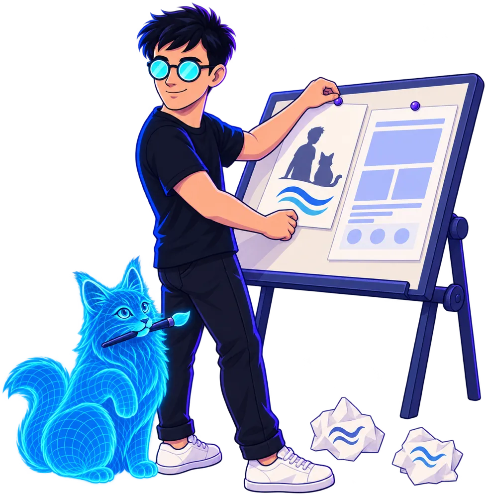
I built this site together with AI in one long session. The most interesting part wasn’t the code but how the idea of what the site should be kept changing.
A brand book made for me — but not for this
Some time ago I had a brand book made: neon green, a space tunnel, a pixel font, headings in small caps. The first version of the site followed it to the letter. It came out neat and recognisable — and I liked it less than the plain layout before it.
The conclusion was simple: a brand book is good for a cover, merch and an avatar, but on working pages the loud layer shouts over the content. You need to separate the brand’s “core”, present everywhere, from the “promo” layer, given in small doses.
Illustrations as the core
What I had liked for a long time were the illustrations: a character in round glasses with glowing lenses and a holographic cat. They became the main element, with a calm layout around them.
The old illustrations were dark scenes in frames, and the site still felt heavy with them. So AI drew a new series: first a single test picture, then — using it as the reference — all the others. The key difference is a transparent background: the pictures sit equally well on the light and the dark theme.
The logo, third time lucky
The logo had to be redone three times, and each time I learned something about my own taste:
- A helmet with glowing glasses in the visor. Interesting, but complicated.
- A cat with a binary tail. Pretty — and wrong: the cat is the mascot, and the logo has to stand apart from it.
- A “B” made of two waves. My surname comes from the Russian word for “shore”, and this turned out to fit best.
The last step was to drop the gradient. A logo should be flat and work in a single colour: in the header, on a browser tab, in print. Gradients and glow stayed with the illustrations.
What I took away
- It’s easier to show and look than to discuss at length. Almost every decision here was made after “let’s see it on the site”.
- Taste shows through rejections. I couldn’t have described the logo I wanted in advance, but I saw at once which one wasn’t mine.
- The mascot, the logo and the illustrations are three different things with different jobs.